
Woken at multiple points last night by a fierce wind buffeting my windows and blowing cold air in through all the cracks that 100-year-old house can offer. I dreamt of many things, including: mysteries, large back yards, Greek computer engineers, and whether or not to deposit a large bag of religious texts on a park bench and then run away from it.
And you were there! And you! And you!
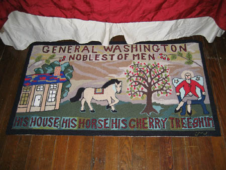
Perhaps vivid dreaming is the result of having a rug like this at the foot of your bed:
posted by Reen |link| 0 comments
Next week my friend Jen, who is one of the few people I have kept up with since the glory days of high school, will be performing two comedy shows in D.C. Since her twelfth-grade days as a twinset-clad debate champion, she has fashioned a strange life for herself of modelling, dressing up as Wonder Woman, referreeing adult spelling bees, and performing standup comedy.
Monday the 26th at 9 p.m., she will be performing at The Red & The Black, along with a couple of bands (Death by Sexy and Monstertail), as well as "art-star" Molly Crabapple, who is something of a figure on the NYC burlesque scene. There's an eight dollar cover, and free red beans and rice when you purchase two drinks. The Red & The Black is located at 1212 H Street NE.
On Wednesday the 28 at 7:30 p.m., Jen and Molly will have a comedy show at the DC Arts Center, located at 2438 18th Street NW in Adams Morgan. $10 cover goes to support hungry comedians and a fanastic local art space.
So come on out! See the past made future! And maybe some nice, funny girls dressed as superheroes!
***
On a slightly different note, the Cornell and Johns shows are still with us, at various outposts of the Smithsonian. I'm thinking of going this weekend, while it is still somewhat chill and cloudy, and the desire to stay outside all the time hasn't set in.
posted by Reen |link| 0 comments
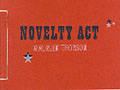
Our first contender, pulled randomly from off my bookshelf, is Anselm Hollo's with ruth in mind, as published by Station Hill Press in 1979.
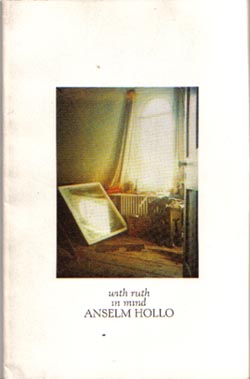
It's a "painting-in-a-box" (or, rather "photo-in-a-box") format, but this one is fairly well used. The entire cover design speaks of simplicity. The white background, the photo being perfectly centered, and the simple but effective typography. This isn't a cover design doesn't directly call attention to itself, but it does serve as a subtle advertisement for whoever picks it up, simply by being a bit mysterious.
It also calls our attention to a rather nice, open, humanistic text face: Kennerley. Both the Roman and Italic versions are on display here. Not only is the cover set in them, the text of the book is as well. To boot, the face is not only very legible and open, in this book it is set very well -- well-kerned and close, but because the letters are themselves rather wide, legibility is preserved. It also has a very florid ampersand which lends some pizzazz to the text, particularly as the ampersand is used in place of "and" wherever an "and" would be called for.
Any comments from Le Gallerie Des Peanuts?
posted by Reen |link| 0 comments
posted by Reen |link| 0 comments
Not only did Clarence Thomas the Fish die yesterday, his human counterpart entered into Bizarroworld as well, siding with Ginsburg and Stevens (and Scalia -- natch. Some things neither heaven nor earth nor time may change) in a takings case, of all things. Here's the opinion, for all you poetry/typeface/due-process nerds out there.
P.S. Okay, it's not really a takings case. It's taking of property without due process here, not taking without just compensation or other eminent domain stuff. But still. Scalia-Thomas-Ginsburg-Stevens. Ouch!
posted by Reen |link| 0 comments
I have this idea (very warped, I know) that I should be able to discern thirty or so common typefaces at a glance, and spent part of last night trying to figure out the difference between Helvetica and Univers. Subtle...you can tell easily from looking at the lowercase a and the uppercase Q (but how often do you run into uppercase Q?) Univers employs a thicker stroke and is a bit narrower than Helvetica, but if you're looking at a heavy or semi-bold version of the Helvetica, you'd probably be very easily confused. They both have really high x-heights for their size as well.
Nerd alert: chuckling over snarky Amazon user reviews of various books on type and book design. A good example, commenting on Derek Birdsall's Notes on Book Design: "Addditionally, his choice of a typewriter font for the text make the book useless to the reader. Birdsall insists his publisher could not choose a better font--I doubt that. I got one for ya, Birdsall--Garamond. You should try it some time!"
And then I laughed. Because I am a nerd. A big big typeface nerd.
Also, I have conceived a hatred for Bodoni. I hate that typeface. It makes me fear robots and moonmen. It's just too precise.
posted by Reen |link| 0 comments
Even in the midst of death, we are in life...as my mother proved on Saturday, taking advantage of a puddle in the yard to go ice-skating for the first time in many moons. With all her courage in hand and my father snickering gently from a removed position, she set off. Here you can see her progress:
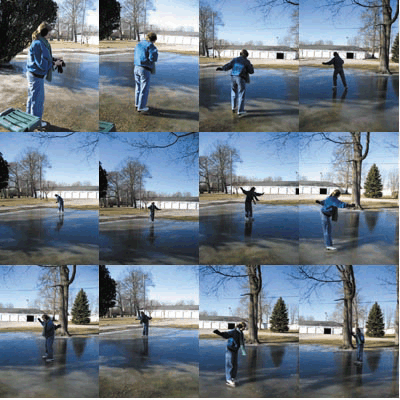
And she never fell. Huzzah!
posted by Reen |link| 0 comments
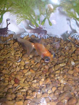
I arrived home to find Clarence a still sad thing, caught up in the feathery embrace of a plastic plant. He had been growing a bit peaked-looking of late, but when I left him, his fins were proud and erect and he had been swimming around more freely. Alas, not even awesome fish named after Supreme Court justices can live forever.
posted by Reen |link| 0 comments
Many picture-posts this evening, when I am back in D.C. My mom is sending frozen lasagna with me. By the time I get home, it will no longer be frozen and I can eat it for dinner. Yay!
posted by Reen |link| 0 comments
There are some wonderful poetry book covers/designs, and some terrible ones. Some rather excellent ones I can think of off the top of my head include Lisa Jarnot's Black Dog Songs and Noelle Kocot's Poem for the End of Time and Other Poems. Alice Notley's Grave of Light also has a very clean, eye-catching design built around a collage that Notley herself created.
The former two books were both designed by Quemadura. Does anyone know anything about them? The website is very stripped down, but a look through their "works" page is an education in good cover design, particularly for poetry, which suffers from a lot of cliches and just plain unimaginative design. For example, take "the painting-in-a-box" design. Ughhhh. Another poetry design horrible is the problem of the way-too-literal designer. Matt Cook's Eavesdrop Soup will always stand out for me in this regard.
Any other outstanding (or hideous) recent poetry book designs that you can think of? When I am back at home and surrounded by my books, I think I'll start blogging my critiques of the designs/covers of random poetry books from off my shelves. This will help me to categorize and consolidate my own thoughts on design, while getting feedback from you guys. We can have passionate disagreements about the appropriateness of certain typefaces!
It will be totally rad.
posted by Reen |link| 0 comments