Our first contender, pulled randomly from off my bookshelf, is Anselm Hollo's with ruth in mind, as published by Station Hill Press in 1979.
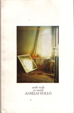
It's a "painting-in-a-box" (or, rather "photo-in-a-box") format, but this one is fairly well used. The entire cover design speaks of simplicity. The white background, the photo being perfectly centered, and the simple but effective typography. This isn't a cover design doesn't directly call attention to itself, but it does serve as a subtle advertisement for whoever picks it up, simply by being a bit mysterious.
It also calls our attention to a rather nice, open, humanistic text face: Kennerley. Both the Roman and Italic versions are on display here. Not only is the cover set in them, the text of the book is as well. To boot, the face is not only very legible and open, in this book it is set very well -- well-kerned and close, but because the letters are themselves rather wide, legibility is preserved. It also has a very florid ampersand which lends some pizzazz to the text, particularly as the ampersand is used in place of "and" wherever an "and" would be called for.
Any comments from Le Gallerie Des Peanuts?
posted by Reen |link| 0 comments